

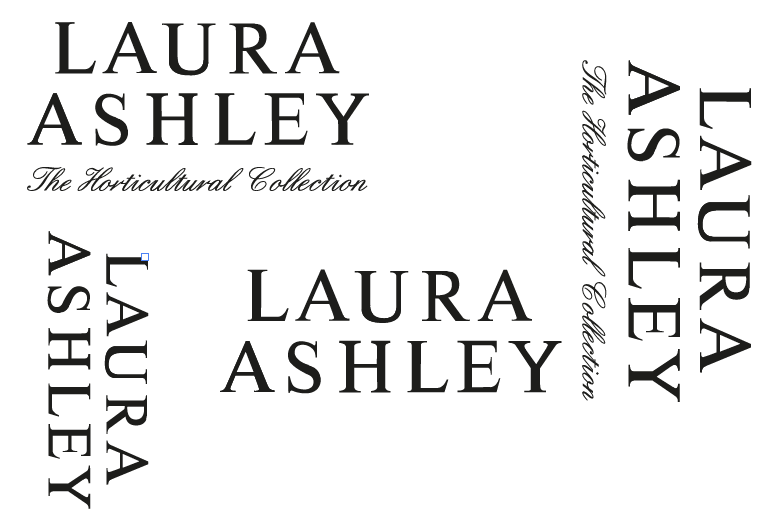
For a couple of hours today (much longer than I originally anticipated... goes to show that you should always expect the unexpected!) I spent some time developing potential logomarks for the hypothetical Laura Ashley S / S 2013 Home Interiors Collection, 'The Horticultural Collection' that Steph and I will be working on together as a significant brief throughout the Final Major Project module.
Despite looking high and low on the internet, I could find neither a vector image file, or the name of the font used for Laura Ashley logo, therefore, I decided to trace it, though unfortunately had no large image files to work from, so although not perfect, I'm pleased with the progress I made, keeping faithful to the serif grided structure and the anatomy of the type.
From earlier discussions with Steph, we knew we wanted the design to be simple and work effectively, and co - exist with the existing branding, but represent our subject matter and the English heritage of the brand. So, taking this quite literally, I experimented with various script based types, and decided to use the font 'English', going on to edit the script for a continous connection of the letterforms to create an elegant and calligraphic design, which, I think sits really well with the bold uppercase serif of the Laura Ashley logo, and whilst visually communicative, is still quite open to the application of various print processes and methods of illustrative design, which are yet to be resolved.
Looking forward to seeing Steph in the next couple of days and hopefully winning her over with the design, and progressing on with the development of the design deliverables.


great project
ReplyDeletegreat project
ReplyDelete