Again, a little disappointed at the picture quality on my part and inconsistency with the lighting, but unfortunately, despite editing, little can be done at this late stage... apart from learning how to use studio lighting over the summer to go on my to-do list...

Showing posts with label Brief 2 | Hannah Crowson Wedding Planner. Show all posts
Showing posts with label Brief 2 | Hannah Crowson Wedding Planner. Show all posts
Thursday, 23 May 2013
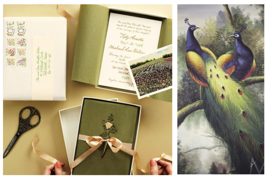
FMP | Hannah Crowson/WedThings Submission Boards
Again, a little disappointed at the picture quality on my part and inconsistency with the lighting, but unfortunately, despite editing, little can be done at this late stage... apart from learning how to use studio lighting over the summer to go on my to-do list...
Wednesday, 22 May 2013
FMP | WedThings Cargo Website

At this early stage in the business, a portfolio of work and images is yet to be fully developed, therefore, I decided to stray from adding too much content at this point, but merely providing an outline for what Hannah can upload and publish at her own time. As a result of this, the purchased domain name, www.wedthings.co.uk, is yet to be transferred over, and the Cargo website, as shown in mock ups here, remains unpublished until the client is ready to use and activate the live site.
Features on the site include heart-shaped thumbnails (as shown above) for visual consistency with the branding, along with the 'WedThings' logomark on the index page, Georgia font body copy for web-safe and search engine sourced information, testimonials, contacts, portfolio, and a blog section, where Hannah can maintain a more informal means of showcasing her inspiration (as on sites such as Tumblr and Pinterest also), with source links shown below (both on the website and this blog post).
Considering the time constraints, I'm quite pleased with the results of the site, and although I would have ordinarily liked to have spent more time developing the website (from scratch, if not from a template), I still feel confident that it is of true reflection and character of the brand and visual brand identity/deliverables.

Source Link


FMP | WedThings Facebook Page

A quick task this evening in putting together the template for a Facebook page for the WedThings wedding decoration brand. Again, like the existing Twitter account, the heart icon and repeat pattern "polka dot" design has been used to tie in with the brand visuals and to give a playful character and aesthetic.
To be used to promote the brand, products and upcoming events for the client in an informal, but direct media.
FMP | WedThings Blogspot Account Design

Along with her other social media outlets, one of the most important devices Hannah has been using to promote her wedding decoration practice, now known as the brand 'WedThings', is Blogspot, which is uses to engage with readers and demonstrate her various designs and wedding decoration ideas.
Although, so far, it was effective in communicating her ideas, there was no real visual identity for the page.
Again, like both Tumblr and Twitter, the visuals have been carried through from the developed branding with a logomark header and black and white colour palette. Although the repeat pattern heart background, like Twitter, was attempted to be applied again here, I feel that the images, like Tumblr, should really do the talking, and the background, if anything, was distracting from that. So, again, keeping it really stripped back, and providing a clear platform to showcase Hannah's images and designs.


FMP | WedThings Twitter & Tumblr Mock Ups

Despite having worked on both the personal Tumblr blog page and Twitter account for Hannah Crowson/the WedThings brand a couple of weeks ago now, I have only just got round to mocking them up in time for designing my boards for print and submission next week.
Here, showing the consistentcy of the type, and, in particular, the heart "polka dot" repeat pattern used throughout social media to maintain a visual consistency in bold black and white colour palette for digital design, and printed on kraft paper stock for office supply and stationary deliverables.
All images shown mocked up on the Tumblr page can be originally sourced through the blog: www.wedthings.tumblr.com.

Tuesday, 21 May 2013
FMP | WedThings Print Developments

Documenting print developments made yesterday for the WedThings / Hannah Crowson Wedding Planner brief, having made a few changes and compromises in the past week, particularly in the change from screenprinting to digital printing (largely to be able to pick up the fine details and weight of the type).
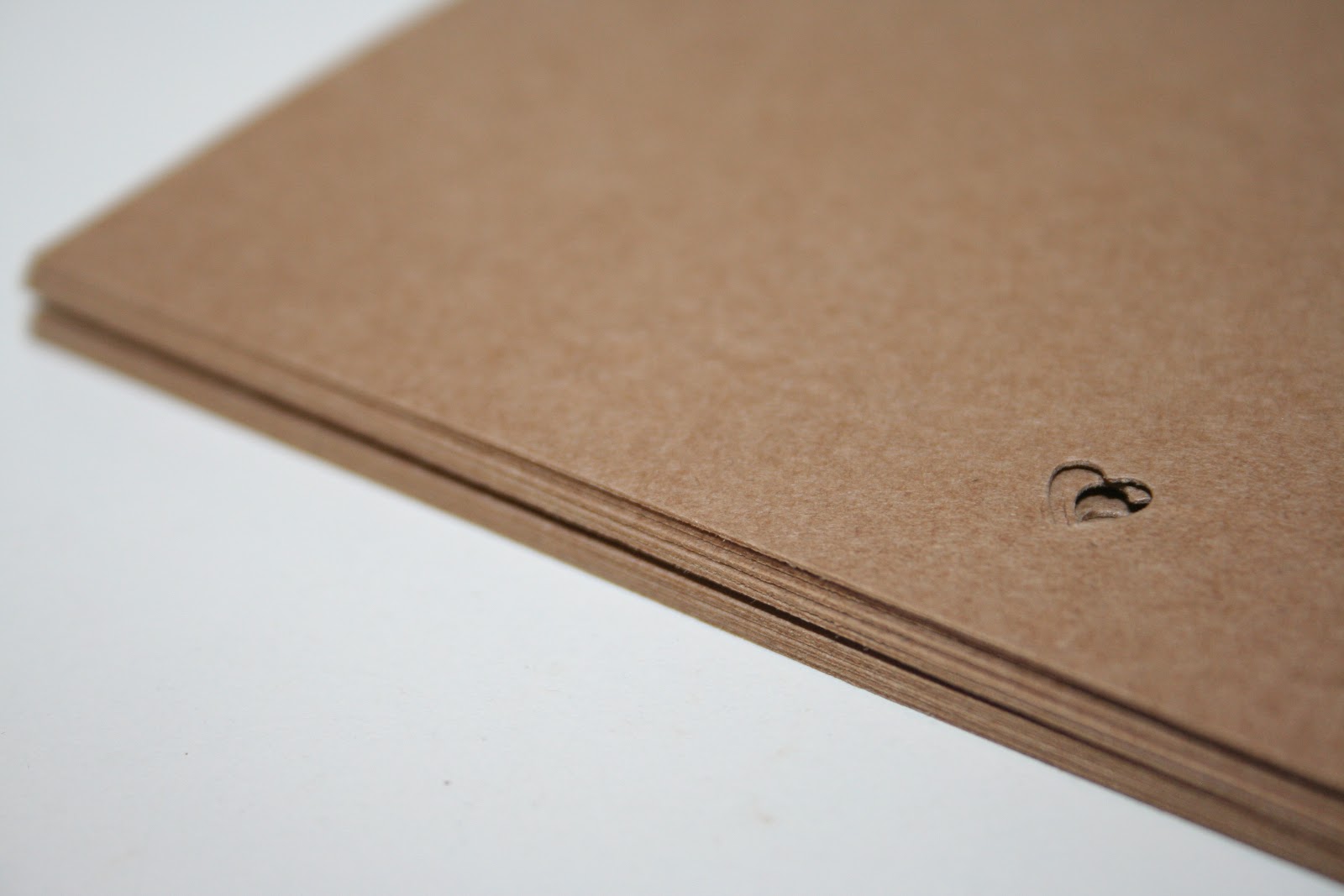
Although changes have had to have been made, I'm actually really happy with how the brief deliverables are coming together, with a simple, yet bold, playful design which I think suits both Hannah and her upcycled approach to wedding decoration well, with attention to detail throughout, such as the heart-shaped hole punch, which I hope will really make the deliverables stand out.
I'm looking forward to getting all deliverables (just a couple more designs to print) finalised and photographed on Thursday to present for the module submission, and, of course, to Hannah, next week.


Monday, 20 May 2013
FMP | WedThings Changes to Print Deliverables

After a few very busy days of printing and finalising designs for submission and designing submission boards themselves, along with numerous other factors, some compromises have had to have been made throughout the deliverables and aesthetic outcomes in briefs.
Notably, in the WedThings / Hannah Crowson Wedding Planner print outcomes, we had proposed to print white ink on kraft paper stock through screenprinting. However, through ink stamp tests we found that the readability and legibility of the ink type was too compromised, and therefore, we have settled on using digital print black ink (as initially proposed) for the stationary. Although, of course, this isn't as "upcycled" or "DIY" in appearance as we'd hoped for with the more tactile, textured screenprint effect, the kraft paper stock will still add a really natural and craft-like feel to the overall range of brand deliverables.
Sunday, 19 May 2013
FMP | WedThings Accounts File Organiser
Design proposals for print of the stationary accounts file organiser for the WedThings office and brand stationary, consistently branded with the 'Abraham Lincoln' type used throughout the print and web-based design deliverables, along with heart-shaped hole punch feature and with (now, after some unfortunately disappointing printing attempts of white screen print/stamp ink) with black digitial ink for the typographic design details, here shown with the outline design and a proposal for the visual outcome when printed onto kraft paper/card stock, along with the other consistent print outcomes.
Saturday, 18 May 2013
FMP | WedThings Invoice
Design for the Hannah Crowson / WedThings invoice, with consistent type and branding used throughout, to be printed on the existing letterhead design to ensure cost-effectiveness in printing and reproduction for the client.
Hopefully to be screenprinted white on lightweight kraft paper brown stock next week to maintain a DIY upcycled - like visual outcome which is consistent to the WedThings brand.
Tuesday, 7 May 2013
FMP | WedThings Notebook & Sketchbook Covers
Repeat pattern heart polka dot print to screenprint white on kraft paper stock to cover pre-bought notebook and sketchbooks for the WedThings stationary and office supplies deliverables range, hopefully to be printed within the next couple of days.
Wednesday, 1 May 2013
FMP | WedThings Stationary to Screenprint
Preparing the screenprinted items and design to print and then (hopefully!) expose on Friday down at the Vernon Street print room. Looking forward to doing something a little different, as screenprinting is a process I don't often get to experiment with, but I'm sure that it will really be worth it, and create a beautifully textured finish that, hopefully, should be ideal in terms of visually communicating Hannah's own design style and portfolio.
Looking forward to seeing the results soon!
FMP | WedThings White Stamp

A couple of days ago, the white pigment ink stamp I ordered online arrived for test prints of the WedThings logo stamp design. Although initially quite enthusiastic to try out the stamp, I was pretty dissapointed when the results were very watered down to the point of which the type was almost completely illegible, particularly in contrast to the black ink design (see above and below for comparisons).
Despite this, I still feel that the white is more visually effective and communicates the theme of a wedding far more effectively. Therefore, I have decided to try and screenprint the design in order to catch the smaller details but still maintain the printed stamp finish and texture, which is perfectly suited for Hannah's upcycled, DIY approach to her portfolio and wedding decoration tastes. Hopefully I will be able to get all the printed paraphernalia ready and prepared for Friday, when I hope to visit the Vernon Street building to start printing.

Tuesday, 30 April 2013
FMP | Laser Cut Ampersands

This afternoon I was really pleased to get the opportunity to go down to woodwork to laser cut the ampersands for the Hannah Crowson / WedThings brief. Cutting through 6mm MDF, I was really quite pleased with the robust finish and sturdiness of the type, despite it's delicate nature.
I'm still a little unsure as to whether or not I'm going to stick the separate pieces together to make a thicker bookend, or to use them simply use them as door hanger/signage decoration.
Looking forward to the next crit to hopefully receive some more feedback and suggestions!


FMP | WedThings Confetti Compliments Bag
One of my ideas to expand the WedThings printed deliverables range was to create a little gift token/compliments for the clients that Hannah works with and acting almost as a leave behind from their design and decoration collaboration.
Inspired by the shape of a (flower) seed packet, I have designed a confetti bag, which, when the bottom strip is perforated it can be used to contain and hold the confetti to throw at the bride and groom on the wedding day, or used as a container for confetti and paper based cut outs for table and wedding breakfast/ceremony room decoration.
Again, I hope to screen print white ink onto the kraft paper design, with a 'with compliments' section on the reverse for Hannah to write a personal message to the client.
FMP | WedThings Kraft Gift Bags
Yesterday, after a discussion with Hannah in regards to her product development, she mentioned the fact that she is currently exploring paper cut design (and particularly hearts stamped from song books and book pages), which not only is really well suited to the heart-punch hole punch design that I've recently been exploring with her printed deliverables, but also gave me the idea to create a simple, branded mini gift bag for her clients with daintier and more delicate products and decoration produced.
Again, I have kept the design consistent using white screen print inks on A4 kraft stock for a dainty bag design, with the front face measuring 95mm x 95mm, along with the lining of screen printed heart polka dot repeat throughout the interior of the bag.
I hope to finish the design with heart-punched holes for tags and a white cord handle.
FMP | Ampersand Bookends to Laser Cut
Yet another little adjustment for laser cutting later today... I was lucky enough to have been given a piece of 6mm MDF from the woodwork department which was of a much larger surface area than I initially intend to cut with for my proposed design. Therefore, time permitting, I hope to try to get plenty more cut from the sheet, which will allow me excess and the opportunity to experiment with building up the layers and thickness of the ampersand with strong, wood glue.
Looking forward to seeing the results.
Monday, 29 April 2013
FMP | Ampersand Laser Cut Designs
The proposed 400mm x 400mm square design for laser cutting the ampersand bookends tomorrow.
This morning, I went down to woodwork to discuss my options to buying wood, and agreed that the best option was probably a 40mm/50mm timber which could be easily cut down and produce a robust and high quality finish.
Really excited to buy the wood, and hopefully produce a really high-end result tomorrow!
Sunday, 28 April 2013
FMP | WedThings Tumblr Page

This afternoon, much like her Twitter page, I spent some time working on the Tumblr aspect of Hannah's WedThings social networking, developing a page and choosing a custom layout which was most aesthetically appropriate and visually communicative of the brand and existing design deliverables.
After trying out a couple of backgrounds and designs (along with the application of the repeat pattern heart polka dots, as used on the Twitter background), I felt that simplicity was perhaps most effective as a means to show the images for the inspiration blog (some samples of which here, I have blogged as placeholders), and also to keep the logomark as clear and punchy as possible, and really to showcase Hannah's interests and inspiration within the wedding design and decoration industry.
Along with the proposed Twitter design, I will send this along to Hannah in an email to hopefully gauge some feedback soon for further design developments.


FMP | WedThings Twitter Page

This morning, I spent a little bit of time arranging the design and profile of the Hannah Crowson/WedThings Twitter page.
Not yet having a business profile, I made the profile under the name @WedThingsDecor (WedThings already having been taken, unfortunately), like Hannah's Pinterest page, I took the heart icon to use both as the profile icon itself, and to apply as a repeat pattern background for the page itself. I think the design works quite well and adds a sense of character and playfulness in the polka-dot like pattern in the bold black and white, which could prove to be a suitable digital alternative to the print-based kraft paper stock.
I'm going to forward the proposals on to Hannah later today and hopefully receive some feedback to work with and develop her online presence further.


Subscribe to:
Posts (Atom)