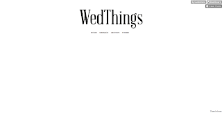
This afternoon, much like her Twitter page, I spent some time working on the Tumblr aspect of Hannah's WedThings social networking, developing a page and choosing a custom layout which was most aesthetically appropriate and visually communicative of the brand and existing design deliverables.
After trying out a couple of backgrounds and designs (along with the application of the repeat pattern heart polka dots, as used on the Twitter background), I felt that simplicity was perhaps most effective as a means to show the images for the inspiration blog (some samples of which here, I have blogged as placeholders), and also to keep the logomark as clear and punchy as possible, and really to showcase Hannah's interests and inspiration within the wedding design and decoration industry.
Along with the proposed Twitter design, I will send this along to Hannah in an email to hopefully gauge some feedback soon for further design developments.


No comments:
Post a Comment