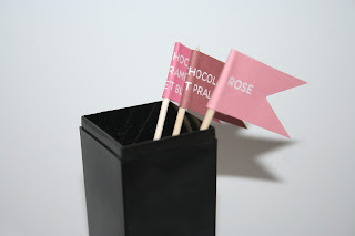
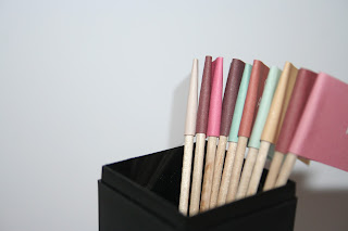
This evening I spent some more time working on trial and test prints for the La Petit Macaron brief, creating the miniature macaron display flags.
Working with both traditional flag shapes and rectangles, after a print test, I felt that the rectangular flag shapes were far more appropriate for the target consumer. Although I want the product and the brand to be communicated as friendly, and full of character, I felt the traditional shape felt a little gimmicky and child like (particularly in the pastel tones), and, after working on a re-print to off-centre (right) the text, felt the rectangular flags looked far more appropriate, and print ready.
Having adapted the colour palette to slightly more pastel, ice cream tones, I was really happy with the spectrum of colours (each representing a different macaron flavour), and think they work really great as a set. Really enthusiastic for the progression of the brief, and hopefully to keep on moving in the right direction.


No comments:
Post a Comment