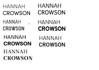
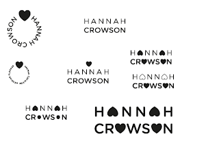
Initially I started working with type, and exploring both serif and sans serif fonts, to give Hannah the choice of a styles that both visually communicated traditionalism and contemporary design. Although Hannah's upcycled style is perhaps far more contemporary, it does pay homage to more feminine, and vintage styles, so at this point, I felt it best to design a variety of options, also working with image to create a more memorable and playful mark that would work effectively translated over a range of both web and print - based media.
In the PDF (as shown above) are the selection of logos which, at this point, I feel have the strongest potential, and would be keen to develop, particularly with the application of colour. I've sent an email along to Hannah and hopefully will receive some feedback shortly in order to progress with the brief and design deliverables as soon as possible.


No comments:
Post a Comment