Tuesday, 30 April 2013

FMP | Laser Cut Ampersands


This afternoon I was really pleased to get the opportunity to go down to woodwork to laser cut the ampersands for the Hannah Crowson / WedThings brief. Cutting through 6mm MDF, I was really quite pleased with the robust finish and sturdiness of the type, despite it's delicate nature.

I'm still a little unsure as to whether or not I'm going to stick the separate pieces together to make a thicker bookend, or to use them simply use them as door hanger/signage decoration.

Looking forward to the next crit to hopefully receive some more feedback and suggestions!


FMP | WedThings Confetti Compliments Bag


One of my ideas to expand the WedThings printed deliverables range was to create a little gift token/compliments for the clients that Hannah works with and acting almost as a leave behind from their design and decoration collaboration.

Inspired by the shape of a (flower) seed packet, I have designed a confetti bag, which, when the bottom strip is perforated it can be used to contain and hold the confetti to throw at the bride and groom on the wedding day, or used as a container for confetti and paper based cut outs for table and wedding breakfast/ceremony room decoration.

Again, I hope to screen print white ink onto the kraft paper design, with a 'with compliments' section on the reverse for Hannah to write a personal message to the client.

FMP | WedThings Kraft Gift Bags


Yesterday, after a discussion with Hannah in regards to her product development, she mentioned the fact that she is currently exploring paper cut design (and particularly hearts stamped from song books and book pages), which not only is really well suited to the heart-punch hole punch design that I've recently been exploring with her printed deliverables, but also gave me the idea to create a simple, branded mini gift bag for her clients with daintier and more delicate products and decoration produced.

Again, I have kept the design consistent using white screen print inks on A4 kraft stock for a dainty bag design, with the front face measuring 95mm x 95mm, along with the lining of screen printed heart polka dot repeat throughout the interior of the bag.

I hope to finish the design with heart-punched holes for tags and a white cord handle.

FMP | Ampersand Bookends to Laser Cut


Yet another little adjustment for laser cutting later today... I was lucky enough to have been given a piece of 6mm MDF from the woodwork department which was of a much larger surface area than I initially intend to cut with for my proposed design. Therefore, time permitting, I hope to try to get plenty more cut from the sheet, which will allow me excess and the opportunity to experiment with building up the layers and thickness of the ampersand with strong, wood glue.

Looking forward to seeing the results.

FMP | Digital Fabric Print Results


Yesterday, Steph and I were really pleased to be able to pick up the finalised printed and steamed fabric from the Laura Ashley Horticultural Collection range, as printed on Friday.
I took the fabric home to delicate machine wash and press for the final stages of the setting of the reactive dyes, as was really pleased to see that the colours had set really well and with no leaking (after a nervous wait!)... really looking forward to seeing these finalised and sewn as a cushion and table runner, which Steph's client for a personal project, a seamstress and textile designer, is very kindly helping us with. Great to see lots of product coming together!


Monday, 29 April 2013

FMP | Ampersand Laser Cut Designs


The proposed 400mm x 400mm square design for laser cutting the ampersand bookends tomorrow.

This morning, I went down to woodwork to discuss my options to buying wood, and agreed that the best option was probably a 40mm/50mm timber which could be easily cut down and produce a robust and high quality finish.

Really excited to buy the wood, and hopefully produce a really high-end result tomorrow!

FMP | Alex Warren Architecture Submission Boards


The proposed submission boards for the Alex Warren Architecture brief, looking at evaluating and reviewing the design concept and development, and the consistency of the brand applied throughout the deliverables.

I'm pleased with how the design range has turned out, and particularly the photographic quality of the mock ups and design, and hope that the client is also pleased with the outcome.

2 additional briefs down, 1 additional and 5 briefs to go! 

FMP | Laura Ashley Catalogue Mock Ups


Spending some time this morning putting together quick proposals and layouts for the Laura Ashley catalogue, utilising Steph's pattern designs and Photoshopped living room scenes to represent The British Horticultural Collection for which we are designing, and proposing a range of brand and promotional materials.

I think the simplicity and use of high resolution images will really sell the proposed stock, and hopefully we can work together and reflect upon past Laura Ashley designs to create a representative editorial design.

Sunday, 28 April 2013

FMP | WedThings Tumblr Page


This afternoon, much like her Twitter page, I spent some time working on the Tumblr aspect of Hannah's WedThings social networking, developing a page and choosing a custom layout which was most aesthetically appropriate and visually communicative of the brand and existing design deliverables.

After trying out a couple of backgrounds and designs (along with the application of the repeat pattern heart polka dots, as used on the Twitter background), I felt that simplicity was perhaps most effective as a means to show the images for the inspiration blog (some samples of which here, I have blogged as placeholders), and also to keep the logomark as clear and punchy as possible, and really to showcase Hannah's interests and inspiration within the wedding design and decoration industry.

Along with the proposed Twitter design, I will send this along to Hannah in an email to hopefully gauge some feedback soon for further design developments.


FMP | WedThings Twitter Page


This morning, I spent a little bit of time arranging the design and profile of the Hannah Crowson/WedThings Twitter page.

Not yet having a business profile, I made the profile under the name @WedThingsDecor (WedThings already having been taken, unfortunately), like Hannah's Pinterest page, I took the heart icon to use both as the profile icon itself, and to apply as a repeat pattern background for the page itself. I think the design works quite well and adds a sense of character and playfulness in the polka-dot like pattern in the bold black and white, which could prove to be a suitable digital alternative to the print-based kraft paper stock.

I'm going to forward the proposals on to Hannah later today and hopefully receive some feedback to work with and develop her online presence further. 


Saturday, 27 April 2013

FMP | WedThings Door Hanger


The finalised, proposed design for the WedThings door hanger, along with the monochromatic design to print to then be exposed for screenprinting.

With the proposal to print with white ink on the brand kraft paper/card stock, I hope to screenprint the design within the next week or so, and then cut the heart handle detail by hand. I will also duplex the card for a reversible design to ensure extra sturdiness and longevity of use.


FMP | Alex Warren Architecture Stationary Photographs


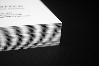
This afternoon, despite not having access to a photography studio, I decided to try and take some photos for the submission boards of the Alex Warren Architecture brief. I didn't expect the results to be all that good, but fortunately, a trusty camera and good natural lighting were on my side, and I managed to take some images that I'm quite happy with, with strong contrast, which I think sell the monochromatic brand stationary well, along with the attention to detail in print finishes, such as the duplex cards, wonderfully finished, as ever, by moo.

I'm really pleased that I've managed to get this task sorted today, and hopefully tomorrow I'll have the submission boards together for printing next week... and another additional project to check off the list for the FMP module!


FMP | Digital Fabric Print Washing Instructions


Digital fabric print washing instructions, as picked up from Uni yesterday, for when we collect the Laura Ashley digital print, having been steamed, in order to prepare it for hemming and sewing.


Friday, 26 April 2013

FMP | Si Scott Lecture Notes


Notes from today's visiting professional lecture by designer, Si Scott.

NOTES

-

* Background interests in typography at art college. Enjoyed drawing but had no focused concept of Graphic Design.
* Hand drawn work was a necessity from not knowing how to use a computer.
* Work shown and portfolio reviewed at D&AD after college, which lead to further internships and opportunities.
* Started working on record sleeve designs in his freelance, illustrative style which lead to more exposure.
* Got a commission at Casio in Manchester, leaving London, and got his agent, which lead onto snowballing ad work and campaigns.
* Do what the client wants, and then give more, if you have time.
* Worked on a great deal of campaigns, particularly editorial.
* Tiffany & Co. were big clients, through shop campaigns and Christmas cards.
* Works regularly on book cover designs (e.g. Zadie Smith, Changing My Mind).
* Worked with Matthew Williamson on a mechanical insect surface pattern/fashion range.
* The way to generate work is to create your own work. Make time for your own work.
* Always give people more than what they ask for.
* Art not Ads billboard in Manchester.
* Learned how to tattoo to translate his work through different mediums.
* Print makes so much impact... always bring more attention to you and your work.

FMP | WedThings Ampersand Bookend


The finalised outlined, flattened and saved ampersand bookend ready as a Version 10 Illustrator file for laser cutting on my booked session on Tuesday in an approx. 5mm light wood.

From the previous design, I have made the weight line a little thicker to hopefully make for a sturdier office supply and more practical usage.

FMP | Laura Ashley Digital Fabric Printing


In preparation for digital fabric printing today, Steph, my collaborative design partner for the project, had sent me the original illustrator files for the repeat patterns she has designed for the proposed Laura Ashley collection, and I went on to format them for the University fabric print/disperse dye system.

Planning to create both a coffee table runner and cushion cover, we used both the iris and small pansy designs (1000mm x 500mm and 480mm x 960mm respectively), importing into Photoshop to layout in a 1 metre square TIFF file format to ensure cost-effectiveness and efficiency when printing.

Having gone down to print this morning, I'm really pleased with the results, and Steph's watercolour work has translated with real sophistication and elegance onto the silk habotai white fabric, with a light, delicate weight.

Really looking forward to picking up the steamed fabric on Monday, whereupon Steph has made a great connection (through her own personal briefs) with a haberdasher and seamstress who has kindly offered to help us finish and construct the design deliverables.


FMP | 26.04.13 Yearbook Meeting Notes


Unfortunately I couldn't make it to the yearbook meeting this morning, due to print commitments, but I was really grateful that both Kirsty Hardingham and Kirsty Alderson, two of our yearbook team members were able to go.

From the feedback and notes passed on, the response for the initial designs for the yearbook seemed good, and really the main note was really to just keep developing the designs, and get proofs sent out asap, as well as checking the brand guidelines.

As my responsibility for admin and sending emails along to the tutors and course team(s), the important notes for me to remember are:

* Send all files to Amber from this point on (under 5GB).
* Send low res PDF to Fred today on fredb@students.leeds-art.ac.uk
* Send Duncan PDF after, when complete today for proofing by Wednesday.
* Send Amber copy of the PDF when proofed to send on to the Marketing Department.

Thursday, 25 April 2013

FMP | La Petit Macaron Small Bags


This evening, after an afternoon print session, along with other paraphenalia for the 'La Petit Macaron' brief, I also had the opportunity to work on developing the nets and constructing the finalised print designs for the small take away and gift bags for the range of brand packaging and printed deliverables.

Although by no means perfect (it always gets to me how creasing the card will always, without fail, result in exposing the white weave of the paper stock... I can't wait until I can professionally print and ease the pain!), I was quite pleased with the finish, and felt the circular holes punch for the satin ribbon worked well in balance with the polka dot print, and, again, the colours sit well together for an eye-catching, yet soft pastel visual impact.

Looking forward to developing more designs and print resolutions to start to see the full range and products come together.


FMP | Macaron Lollipop Flavour Tags


After popping down to digital print earlier today, I spent some time working on preparing the macaron lollipop sticker flavour tags. Like the macaron flags used in the displays, after the single macaron lollipop boxes didn't quite work, I decided to try a different approach, and thought that using kebab skewers as a lollipop stick could be quite a fun and fashionable way to present the product, as well as adding to the playfulness of both the product itself, and, most importantly, the brand.

Again, the tags tie into the individual flavours through their French translated name and swatched colour. Unfortunately today I forgot to print the pistachio tags, but hopefully I'll get the opportunity to reprint them again at Uni within the next couple of days.


FMP | Single Macaron Pack Print


Today I was fortunate enough to get the opportunity to work on some print production in the digital print room, and start to produce tactile outcomes for the La Petit Macaron brief.

With the initial concept of my single macaron boxes and nets not working as effectively as I would have originally liked, I decided to re-design the single packaging into a paper bag (inspired by sweet and candy stripe bags), again, both in the in-house PANTONE green brand spearmint colour and polka dot print for the gift wrap design, and elongating the shape for a vertical composition to reflect the consistency of the rectangular shapes found in both the presentation boxes and branded stationary design (mini business cards, envelopes, etc.)

I'm pleased with the outcome, and, again, I think the simplicity works well to represent a high-end product but with a playful side shown in the polka dot repeat and bright colour palette.


FMP | Laura Ashley Bus Shelter Final


After a quick conversation with Steph earlier today, we both seemed happy with the simple design direction and combination of the editorial type and promotional design with her photoshopped and repeat-pattern applied images (as shown above), and the idea to carry a visual concept through with a narrative relative to the image content, and the product range itself.

As pointed out by Steph, I tweaked the previously design slightly to show more of the type to reveal 'Opening Soon' as opposed to just 'Open Soon' (always great to have another pair of eyes and some good Art Direction... one of the best things about collaborations for me), involving the deleting of anchor points on the outlined text and some photoshop cloning and content filling for the type overlaying the pattern to insure that the hierarchy of the type wasn't lost by the bold background pattern, as developed by Steph herself.